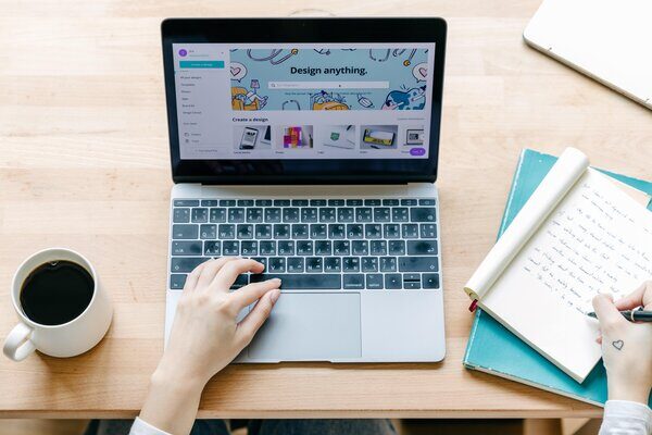
For many small businesses, focusing large amounts of time on designing brand elements can be out of the budget. Fortunately, PR pros and social media marketers have Canva, an online graphic design app that allows users to easily create a myriad of graphics with minimal experience needed.
Here are seven Canva hacks that are sure to streamline your design process and help you create effective, on-brand graphics that will attract and impress your target audiences:
#1: Locking & Grouping Elements

Need to shift multiple elements to somewhere else on your design or make them a different size? Instead of manually doing it for each individual element, click and drag a box over all of the elements, then left-click and select “Group” in the options menu.
From here, you can move (or lock) the elements so that they are placed exactly where you need them to be, or you can drag and resize them to better fit your needs.
#2: Free Moving Elements
Canva’s automatic grid feature for placing elements can be helpful, but sometimes it doesn’t put the element exactly where you need it to be. Don’t worry — all you have to do is hold down the Shift or Command button while moving the element to give you full control over element placement.
#3: Overlaying Shapes on Photos
Want to use a photo in your social media post but need to make it feel a little more branded? Overlay a shape (most likely a square or rectangle) over the image, fill it with one of your brand colors, and then tinker with the shape’s transparency settings to create an image that really pops.

#4: Utilizing Cohesive Graphics
When you’ve found a graphic that fits your brand’s aesthetic, there’s usually more where it came from! When viewing any graphic in the Elements window, click the three dots in the top right corner of the image; from there, you’ll be able to see other graphics created by the same artist, as well as other graphics that share a similar style.
#5: Maintaining Consistent Spacing
If there are a lot of elements in your design, ensuring that they are all properly spaced and placed can be a painstaking process. Thankfully, Canva has a handy “Position” feature (located in the toolbar that pops up when you click an element) which allows you to seamlessly maintain vertical or horizontal spacing between different elements and text boxes. Give it a try — you might be surprised by how much it elevates your design.
#6: Sharing Your Design on Social Media through Canva
Many social media marketers use Canva to create graphics for social sites, but did you know that you can post your design directly from Canva without having to download the design? From the “Share” menu, select the social platform you’d like to post the design to and connect the account to Canva. No more needing to download designs that take up space on your computer!
#7: Turning Your Design into a QR Code

Most PR pros and social media marketers are tasked with creating designs that will lead target audiences to take action, whether it’s purchasing tickets to an event or heading to a brand’s website to learn more.
Implementing a QR code can be a great way to streamline the process for audiences — and with Canva, any design can be easily turned into a QR code! Once you’ve completed your design, click “Share,” then “See All,” then “QR Code.”
If you’ve got any Canva hacks that have helped your productivity, we’d love to hear them! Follow Scooter Media on Facebook, LinkedIn, Instagram, X, or TikTok and tell us about it.
Can’t get enough Canva hacks? The Scooter Media blog is full of other helpful resources, such as:


