Annual reports are an easy way to highlight the successes of your organization over the past year, as well as an excellent opportunity for telling the story of your brand. While annual reports used to be large documents filled with words on black-and-white paper, those days are long gone; today, most annual reports are visually appealing and informative, with an emphasis on clean design and readability.
Here are some of the latest annual report design trends, updated for 2022:
1. Eye-catching Infographics
As the word implies, “infographics” is a term that implies any kind of information communicated with the support of graphic elements. Annual reports can be very information-heavy and data-dense, so using thoughtful infographics with your brand’s colors and elements is a great way to help break up the info in a visually appealing way.
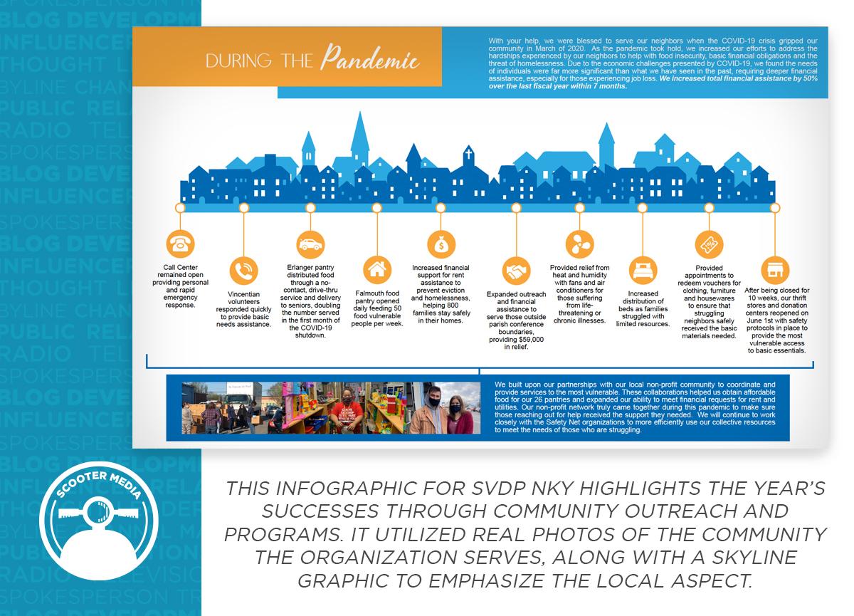
For example, when designing the annual report for St. Vincent de Paul NKY, our team created an infographic highlighting some of the organization’s most important successes of the previous year. A simple community skyline graphic in branded colors along with short bullet points about each success made the graphic easy to follow along with, while also driving home the most important aspect of the organization: the people it serves. Playing with a limited palette of colors, alternating font weights and sizes, and including simple icons helped to bring those successes to life.

2. Engaging Photographic Elements
Similar to infographics and illustrations, well-planned and properly placed photographs can go a long way toward enhancing the look and feel of your annual report. When selecting photos to include, it’s important to take a step back and think about the audience for your annual report is, and which types of imagery will connect best with those audiences.
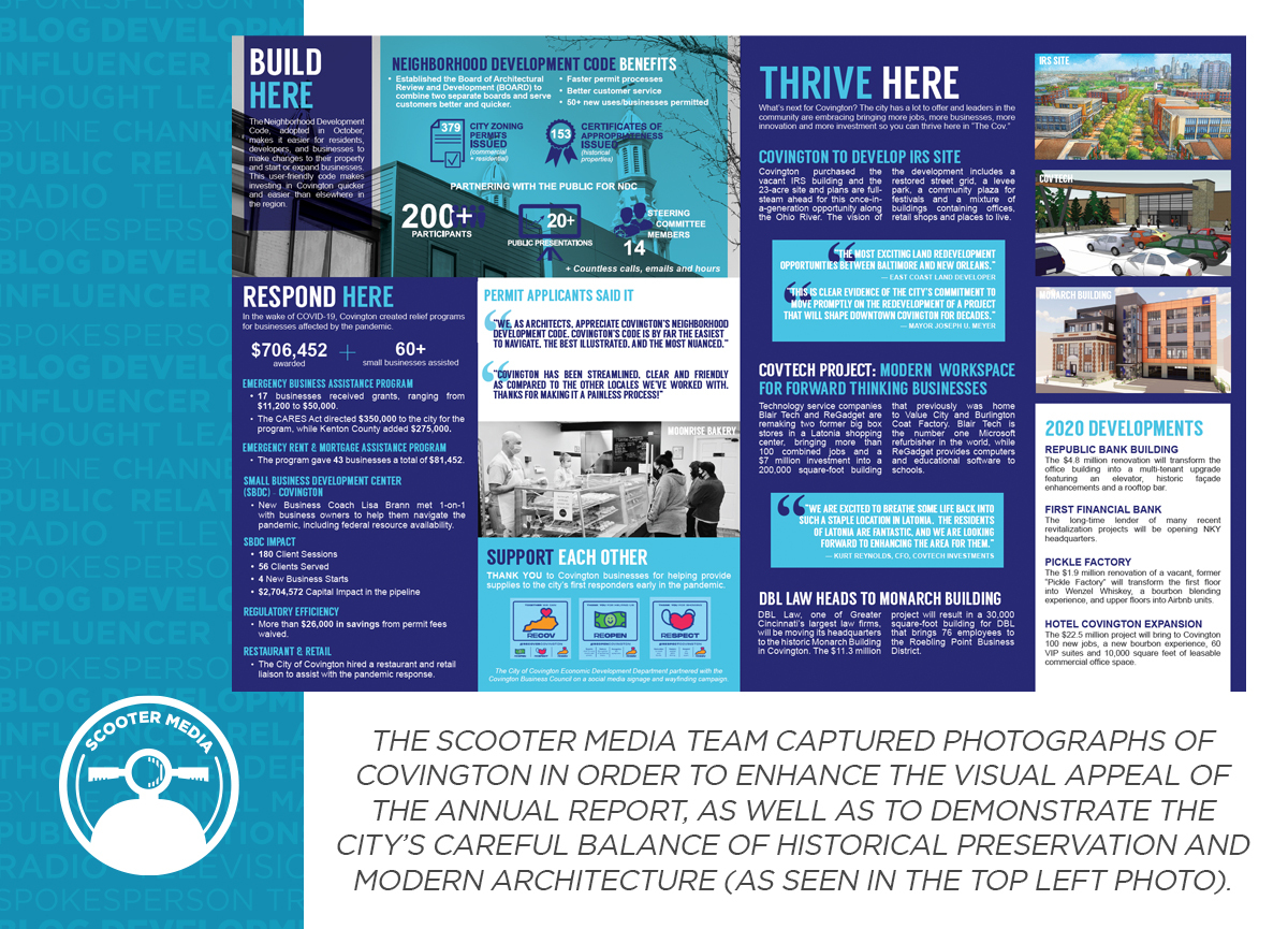
For example, the City of Covington’s Economic Development department wanted to use its annual report to spotlight the growth of the city and pay homage to the long-standing businesses in the community. To achieve this, the Scooter Media team went out into the city and took photographs that showed a balance of new and old, which helped to demonstrate how the two can be juxtaposed harmoniously.
Within the annual report, many of these photos became page backgrounds, so that the stories and infographics on each page could be prominently featured. Color renderings were also used on a page about what’s next for the city, as a way to visually underscore the bright future ahead.

3. Great Stories
Most annual reports contain a letter from the CEO, President, or another important person who can speak to where your organization has been in the past year, as well as where it’s headed going forward. Similarly, it’s also critical to include at least a few stories or editorials that will dive a little deeper into your brand, which will help to demonstrate the context behind the numbers communicated in the annual report.
Consider having other members of your team write about their own successes that led to even bigger wins for the organization as a whole. You can also use your annual report as an opportunity to thank the individuals and partners who have helped your organization achieve its goals over the past year. Sometimes a little sign of appreciation can go a long way — even if it’s a simple list of donors or spotlighting sponsors in the local community.
4. Ease of Access
Many organizations are now taking their annual reports digital; not only can it save on the high costs of printing and mailing, but it can also easily reach a larger audience by being placed on your brand’s website, or linked to via your social media channels.
It’s also critical to consider the accessibility of your annual report. Especially when creating a digital version of the report, you should always be sure to add alt text to images and review the reading order of the piece to help page readers for the blind and visually impaired.
Ultimately, annual reports are not “a one-size-fits-all” template. The best annual reports are those that speak to who you are as an organization and the audiences you serve, in a style that is in line with your brand identity. By carefully thinking through what you want your annual report to communicate and leveraging these trends to help you do it, you’ll be well on your way toward making an annual report that people will want to read cover-to-cover.
Want more graphic design tips? Brush up on the “4 Building Blocks for Establishing Your Brand Identity,” then discover “5 Design Tips to Make Your Social Media Graphics Shine.”


