Looking for our “Creating Your Brand Guidelines” worksheet? Scroll down to download it now!
Whether you’re beginning your own business or starting a nonprofit, building a brand identity is an important step for organizations of all types.
Simply put, brand identity consists of various visual elements that allow audiences to easily recognize your organization and help to tell the story of your company. It is essential to think through the building blocks of your brand identity from the get-go — as having a memorable brand can make all the difference in the long-term success of your organization.
Thankfully, establishing a successful brand identity doesn’t require hiring a large agency, or being a graphic design guru. In fact, building a successful brand starts with a little creativity and an understanding of these key elements:
1. Let Your Logo Do the Heavy Lifting
A logo is the foundation of your organization and the first thing that will come to mind when audiences think of your brand — so make sure to spend time and effort in making yours stand out. It’s also worth remembering that a logo will often be the most element of your brand responsible for first impressions; carefully consider how yours will be viewed by people who know nothing about your organization.
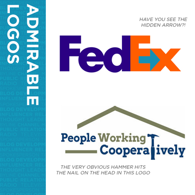
What makes a logo compelling? There’s no “secret formula,” as it varies based on a wide variety of factors. However, two examples that we love are:
- FedEx, not only for its bold colors, but also because of the “hidden arrow” contained in the spacing of the words, which helps to subconsciously reinforce the company’s mission;
- People Working Cooperatively, a Cincinnati-based nonprofit (and Scooter Media client) that creatively uses its logo to communicate the organization’s mission of providing home repairs to neighbors in need.
2. Carefully Consider Your Color Choice
When it comes to conveying the overall feeling of your brand, there’s no more important consideration than color choice. While you can read all about color theory and the meanings (both connotative and denotative) that each color holds, the best way to approach this element is to ensure the colors you are choosing reflect the personality of your brand.
Here are two colorful examples to consider:
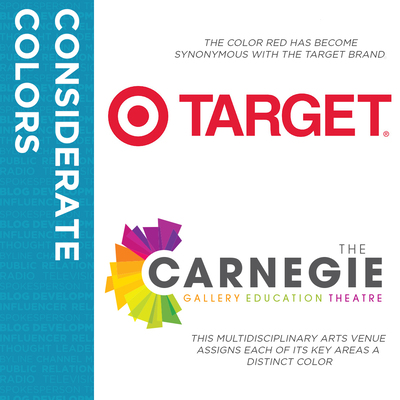
- Target‘s color of choice is a striking red — bold and direct, just like the title of the brand itself.
- Scooter Media client The Carnegie uses color in a creative way, as this multidisciplinary arts venue assigns each of its key areas a distinct color (a bright orange for its art galleries, a lime green for its educational initiatives, and a deep purple for its theatrical productions).
3. Fall in Love with Your Font
Given that a brand identity is all about attracting attention, it can be tempting to make the go-to font for your brand one that is large, flowery, or a little over-the-top … but this is a crucial mistake. The most important consideration to take into account on the typography front is that your font should be immediately legible and speak to the sensibilities of your target audience.
Take these two standout typography examples into consideration:
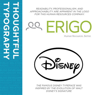
- Our client Erigo, a human resources and employer solutions firm, uses a no-frills, sans-serif font across all of its materials, which speaks to the professional nature of the business and helps to communicate the organization cares about being direct and approachable.
- Disney, one of the most iconic brands of all time, uses a font that is a little more ornate than most brands, but aligns well with the company’s values as it is actually a stylized version of Walt Disney himself.
4. Verify Your Visual Aesthetic
When developing your brand identity, it’s also very helpful to pick a few visual elements that speak to your brand sensibilities. Sometimes, these are obvious; for example, if your business is all about selling a specific product, your key visuals should include real images that showcase beauty shots of the product as well as photos of it being used by your audience.
However, other times establishing a visual identity isn’t so clear-cut. While some industries (such as professional services) may be able to primarily rely on stock photography to communicate the basic visuals of their brand, others might use visuals that are more stylized (or may not even feature real people at all!). Consider the following:
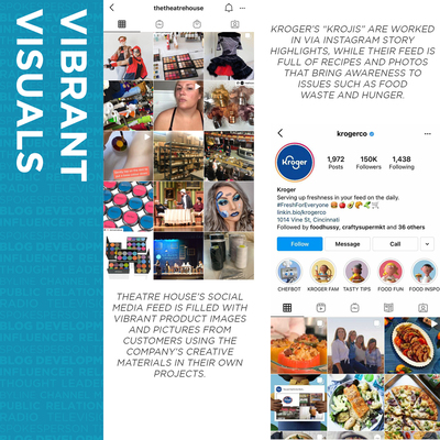
- Scooter Media client Theatre House uses a mixture of photos as part of its brand identity; while it primarily relies on stock photos to showcase the products available in its retail store, the company also shares photos of costumes and makeup looks submitted by customers so that followers are able to see the company’s products “in action.”
- Cincinnati-based Kroger recently rolled out a new ad campaign featuring the “Kroji,” cartoon-based characters that give the brand a more lighthearted feel while still promoting the company’s key values of offering fresh foods at a great value.
Clearly, there is a lot to take into consideration when creating your brand’s identity — but fear not, as the experts at Scooter Media have compiled a handy one-page “Brand Cheat Sheet” to help you navigate the basics. Click here to download it now:
Brand Guidelines Worksheet
Send download link to:
Now, what are you waiting for? Go forward and start designing using these simple tips, and before you know it you’ll be creating some brand magic!
Looking for more tips on graphic design and establishing a brand identity for your business? Read our primer on “Graphic Design & Public Relations: A Mutually Beneficial Relationship,” then check out our “5 Design Tips to Make Your Social Media Graphics Shine.”
