Looking for our “2021 Social Media Cheat Sheet”? Scroll down to download it now!
Now more than ever, a strong social media presence is vital for businesses — and design is one of the first things visitors notice when they interact with a brand’s social profiles.
Similar to poor grammar or misspelled words, social media pages that contain incorrectly sized images or graphics with poor resolution can immediately turn people off to your brand. This is why you should aim to make all of your graphics (including headers and profile images) both reflective of the voice of your brand as well as the appropriate size and resolution for the platform it is on.
For content creators, designing and uploading the correct sizes and resolutions ensures the highest possible image quality and optimizes the maximum “real estate” allotted to your post.
Here are five ways to ensure your graphics stand out in the crowded social media landscape:
- Know and understand that each social media platform is unique – and so are their audiences (and the reasons they use them). People who like photos are far more likely to hop on Instagram, whereas your words are the most vital element of LinkedIn posts that seek to attract potential employees or share client news coverage. (This helpful article will help you understand the audiences of each platform.)
- Use carefully curated images and graphics with your posts and campaigns. Copy alone doesn’t always stop your audience from scrolling, but an eye-catching photo or branded graphic might. The best social media posts are those featuring an evocative image, with copy that compels the reader to click through and engage with your post.
- You don’t have to be a designer to create beautiful content for your clients or business. Follow design specification guidelines for ensuring appropriate color space output, resolution and sizing for the location it will live. Know the file types that work best for your graphic. JPEG’s are great for standalone photos, whereas PNG files are the best for files with any type of logo or graphic elements.
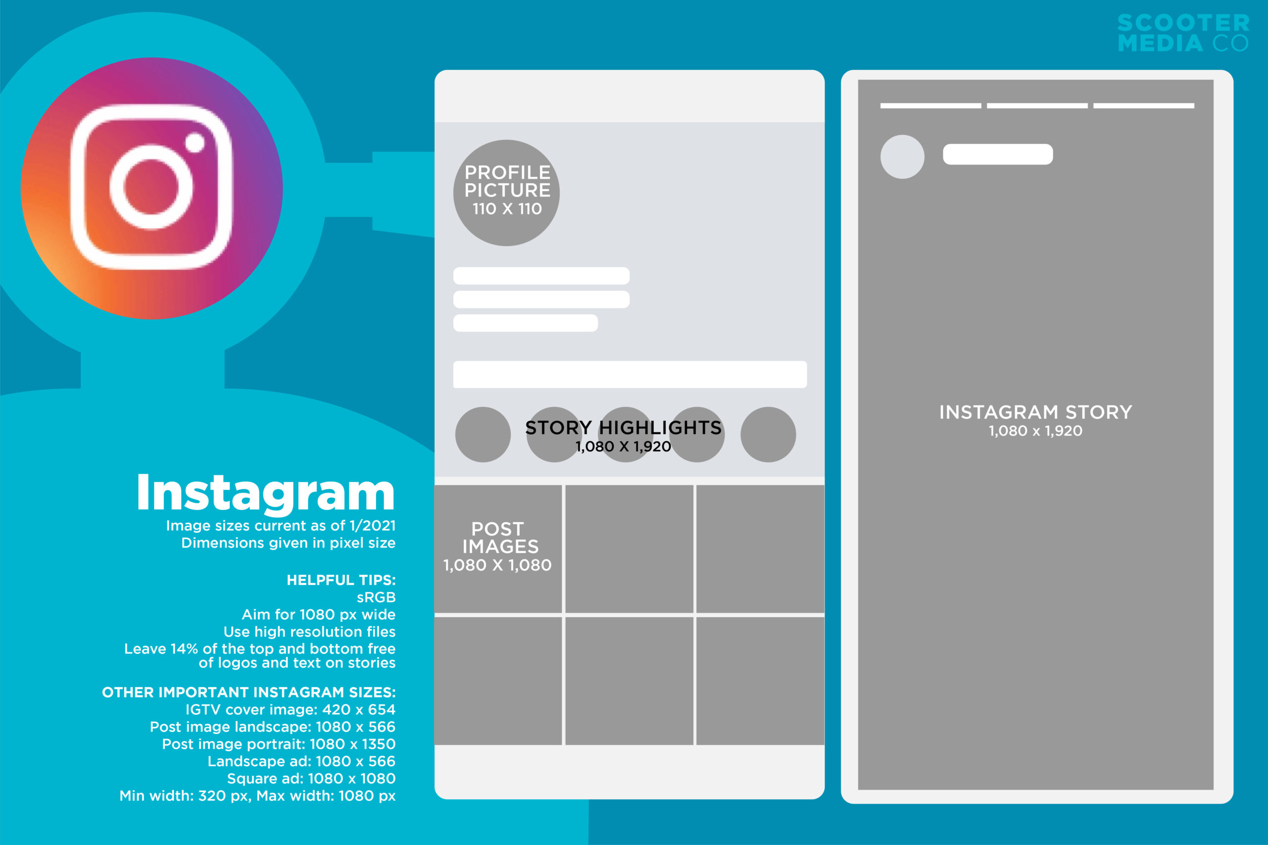
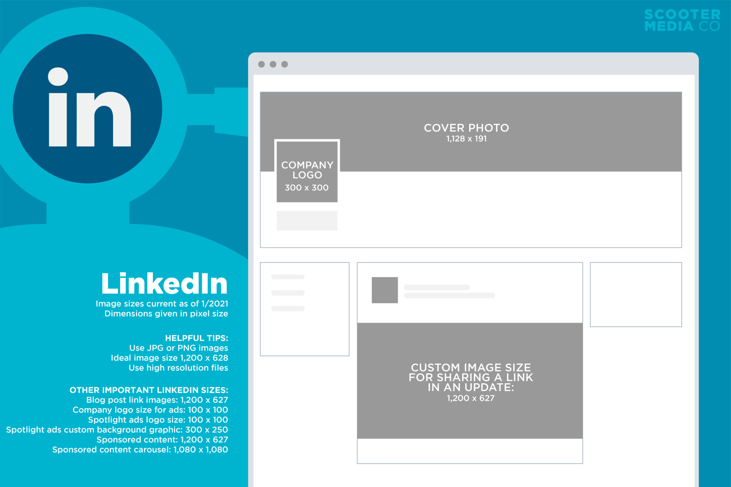
- Square is (fairly) universal. For most platforms, a square (1080×1080) is very versatile and will work in a pinch for cross-posting on Facebook, Instagram and LinkedIn when you might not have the time to resize the image for each platform.
- Create usable content from the start! If you are the person responsible for taking the photos and videos of the products, services or events, spend some time learning the basics of good photo composition to help you when taking the original photos. Spending a little more time capturing good photos “in the field” can save you a lot more time on the graphic design front down the line!
Now what are you waiting for? Go out there and design something special! To help you get started, download this free cheat sheet of the optimal social media sizes in 2021:
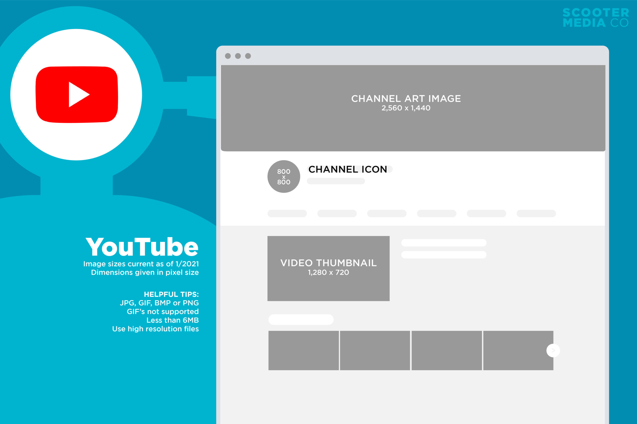
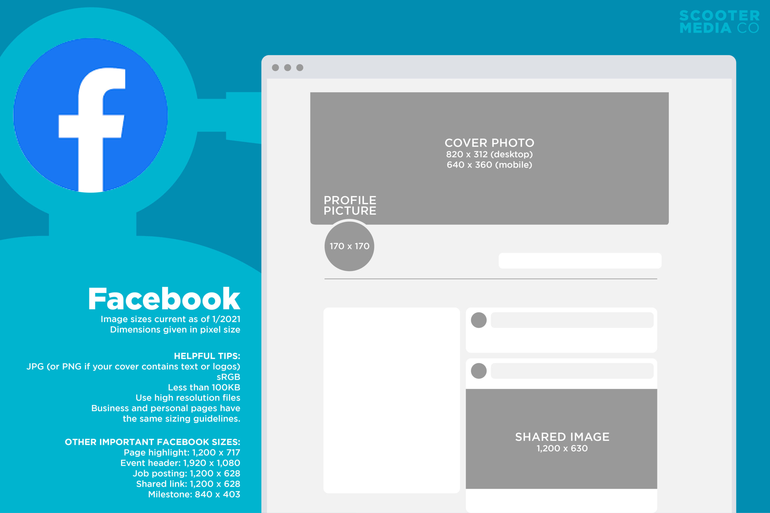
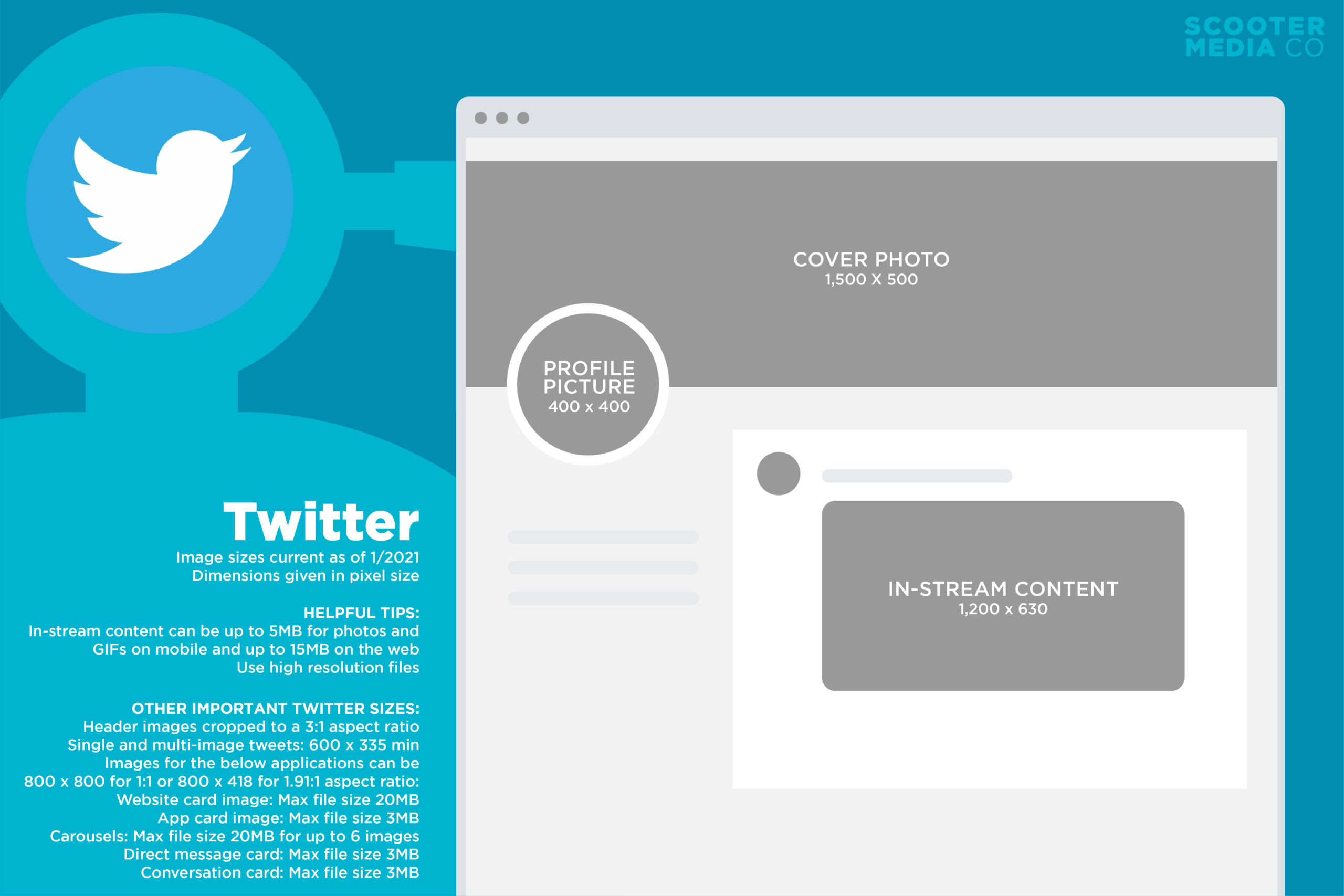
Need a quick reference? Bookmark this page and check out the infographics below to make sure your social media graphics are sized properly every time.
If you’re looking for more tips to make your social media posts stand out, check out our tips for improving videos made in Canva, as well as our guide to creating cover images for Instagram Stories Highlights!
YouTube
