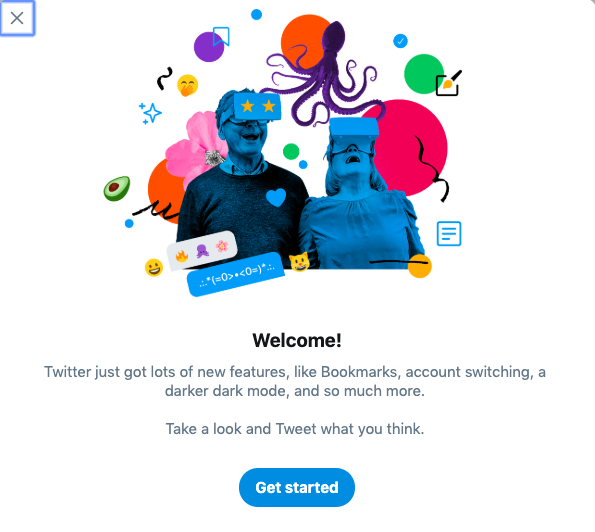
Tweet, tweet. Does Twitter.com look different to you?
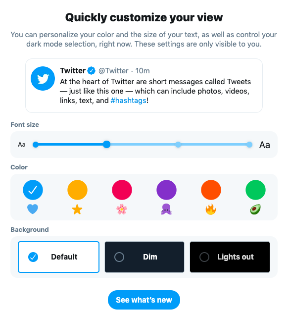
The social media platform is launching a new look for desktop. The new design, announced earlier this year, allows for account personalization, like colors and text size, as well as account switching, bookmarks, dark mode and lists features.
Woah, what’s this? A shiny new https://t.co/q4wnE46fGs for desktop? Yup. IT’S HERE. pic.twitter.com/8y4TMzqBGa
— Twitter (@Twitter) July 15, 2019
Some users have the option to enable the new look and features now.
Users who have access to the new design will notice that the top menu navigation bar has been moved to the left column of the website. The three column layout still features the tweet stream in the center with “Trends for you” and “Who to follow” in the right column.


Twitter says the new Twitter.com experience will be available for all users soon. Some users may see a sneak peak option on their account page in the right column as the redesign continues to roll out. With more than 326 million active monthly users and 5,787 tweets being sent each second, it may take a few days for #NewTwitter to chirp its way on to desktops around the world.
Scooter Media is Your Social Media Resource
Scooter Media is your resource for navigating the ins and outs of the always-changing world of social media. Looking for more social media tips? Check out our primer on Social Media Trends in 2019, along with guides to scheduling your social media posts and delivering exceptional customer service experiences on Facebook. Be sure to check back frequently for new installments of our “Social Media Snapshot” series!


